Below is a brief example of raster visualization in R. It is a more thorough explanation of an example of rasterVIS that I will use in an upcoming lecture to the Anthropology and Geography group of the Social Sciences Department at Cal Poly University. The goal is to gain a brief understanding on vegetation productivity dynamics in the vicinity of San Luis Obispo and the Central Coast using remote sensing and R. I’ve selected 17 HUC 10 watersheds from the National Hydrography Dataset as the area of interest.
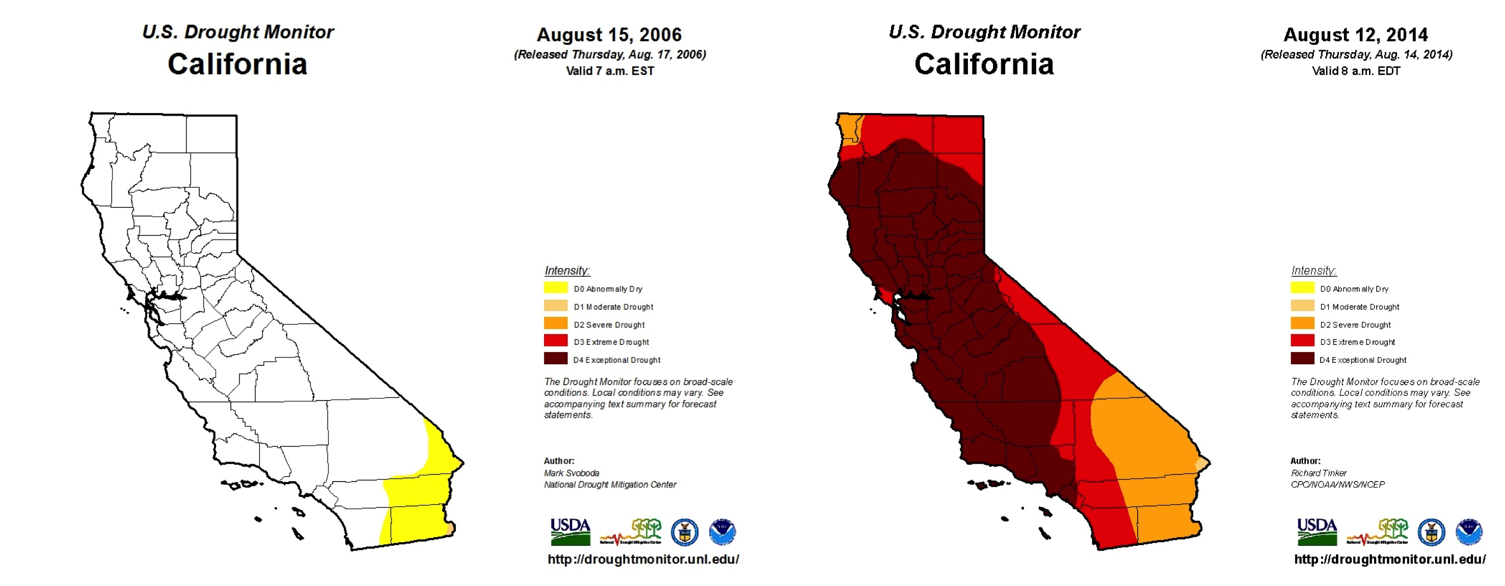
We know when the drought hit at a statewide level from the US Drought Monitor. Now let’s use satellite data and R to visualize the drought at a local scale using a reproducible example in R.

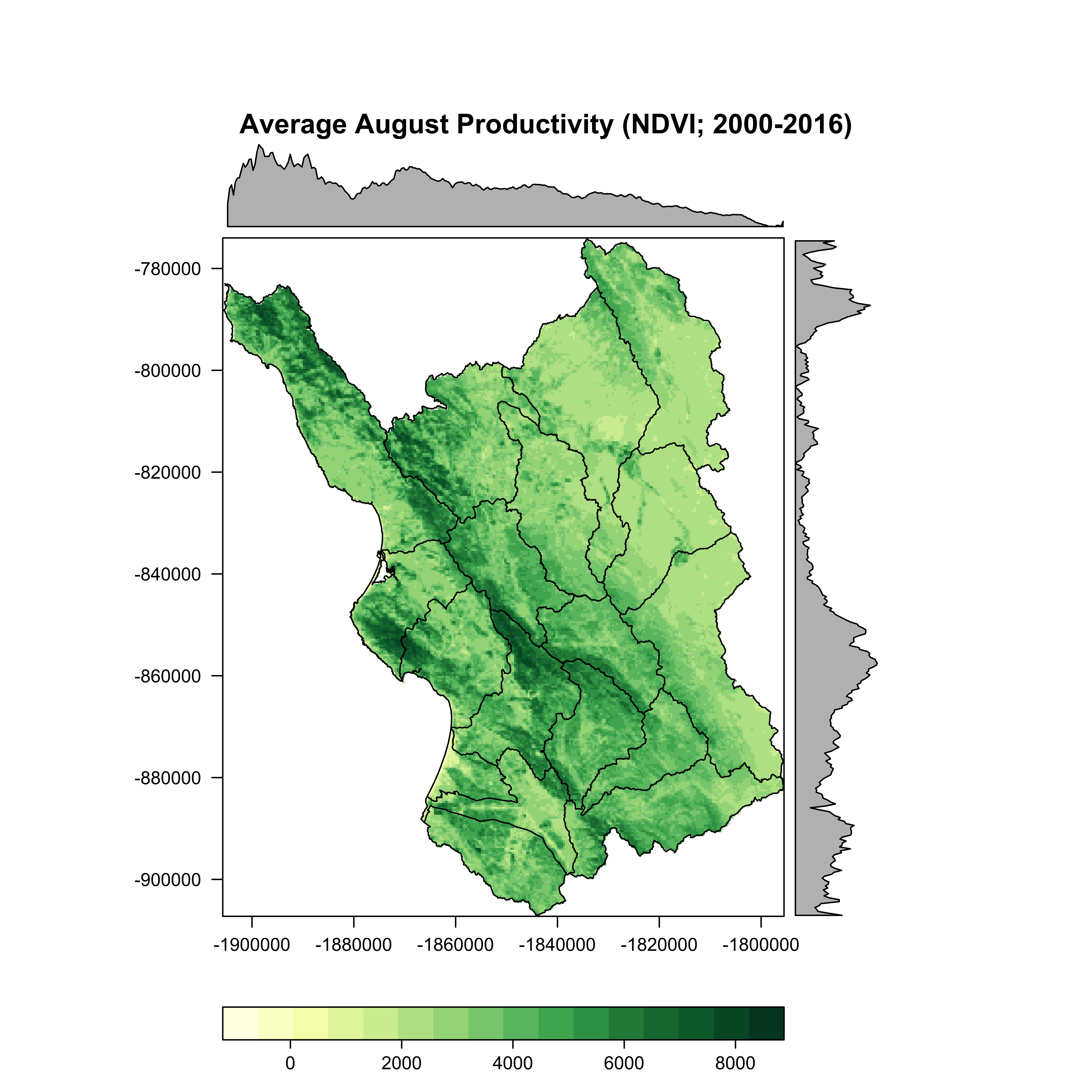
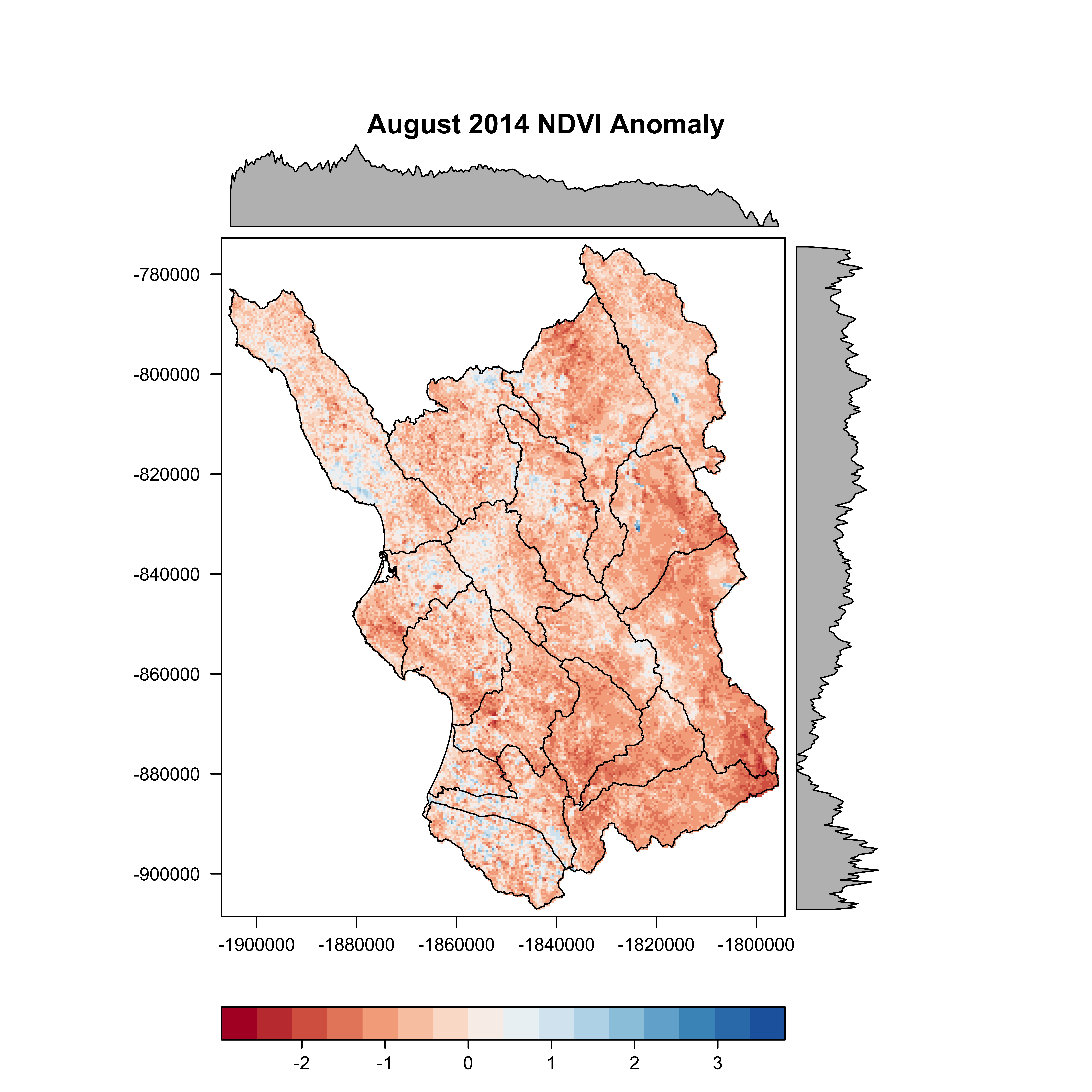
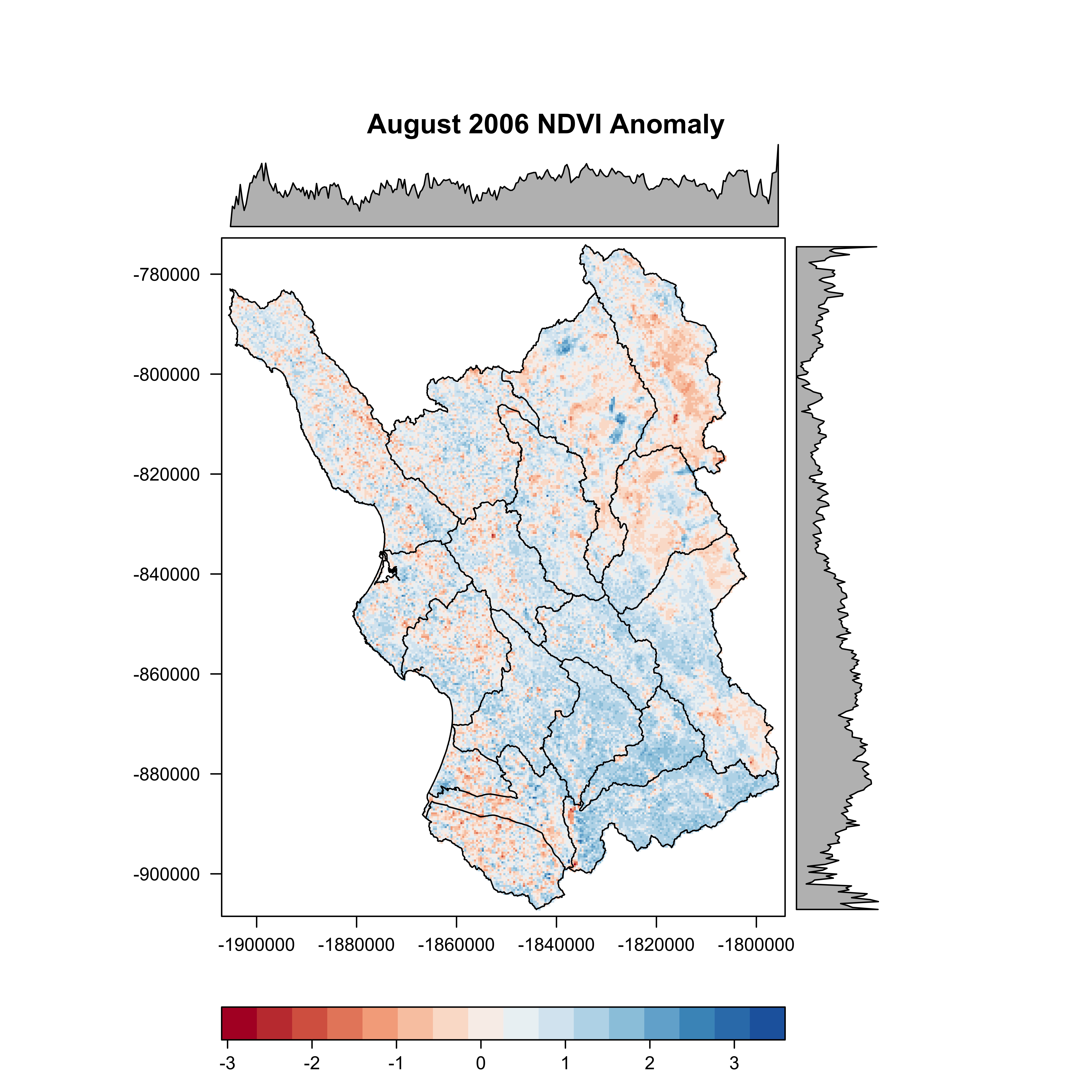
I used eMODIS (EROS Moderate Resolution Imaging Spectroradiometer) data to characterize the NDVI derived productivity of the AOI during the month of August. eMODIS is a standardized product which uses MODIS surface reflectance from a 7-day composite period (Brown et al. 2015). I used all eMODIS images from August during the period 2000 through 2016 to calculate the 17-year August mean. I then calculated August productivity anomalies for a dry year (2014) and an average year (2006) to identify the spatial and temporal variability in productivity within the watershed.
To execute the example below, please download the data here. I have not included the base data or code to calculate the global mean and annual anomalies.
Load the required packages in R (note: the Rcolorbrewer package is loaded with the rasterVis package).
library(rgdal)   #Geospatial Data Abstraction Library
library(raster)  #Geographic data analysis & modeling Lib
library(rasterVis) #Raster Visualization libraryLoad the required data:

#load .shp (proj is the same as the raster data)
huc.shp <- readOGR(".", "SLO_HUC10_LEA")

#load raster data
Global.mean.August<-raster("August_GLOBAL_MEAN.tif")
August.2006.Z<-raster("August_2006_Z.tif")
August.2014.Z<-raster("August_2014_Z.tif")

#plot mean August NDVI 2000-2016
# set a color ramp of yellow to green
cols <- colorRampPalette(brewer.pal(9,"YlGn"))
# create a level plot - for Mean August NDVI
p<-levelplot(Global.mean.August,main="Average August Productivity (NDVI; 2000-2016)",
             col.regions=cols)
# overlay the spatialpolygonsdataframe
map.overlay<-p+layer(sp.lines(huc.shp, lwd=1, col='black'))
#plot the data
plot(map.overlay)

#export graphic
jpeg("Global_mean_August.jpg",width=8,height=8,units="in",res=1200)
plot(map.overlay)
dev.off() # turn off png device

#plot Aug 2014 anomaly (dry year)
# set a color ramp of red to blue
cols <- colorRampPalette(brewer.pal(9,"RdBu"))
p<-levelplot(August.2014.Z,main="August 2014 NDVI Anomaly",
             col.regions=cols)
map.overlay<-p+layer(sp.lines(huc.shp, lwd=1, col='black'))
plot(map.overlay)

#export graphic
jpeg("Aug2014_Anomaly.jpg",width=8,height=8,units="in",res=1200)
plot(map.overlay)
dev.off() # turn off png device

#plot Aug 2006 anomaly (average year)
cols <- colorRampPalette(brewer.pal(9,"RdBu"))
p<-levelplot(August.2006.Z,main="August 2006 NDVI Anomaly",
             col.regions=cols)
map.overlay<-p+layer(sp.lines(huc.shp, lwd=1, col='black'))
plot(map.overlay)

#export graphic
jpeg("Aug2006_Anomaly.jpg",width=8,height=8,units="in",res=1200)
plot(map.overlay)
dev.off() # turn off png device


Top image: MODIS image of central California from NASA Earth Observatory.
