Below is a brief example of raster visualization in R. It is a more thorough explanation of an example of rasterVIS that I used in a recent lecture I gave in the Department of Geography and Environment at San Francisco State University. The goal is to gain a brief understanding on vegetation productivity dynamics in the Yuba River Watershed (where the SFSU Sierra Nevada Field Campus is located) and quickly display the data using Oscar Perpiñán’s excellent R package rasterVis.
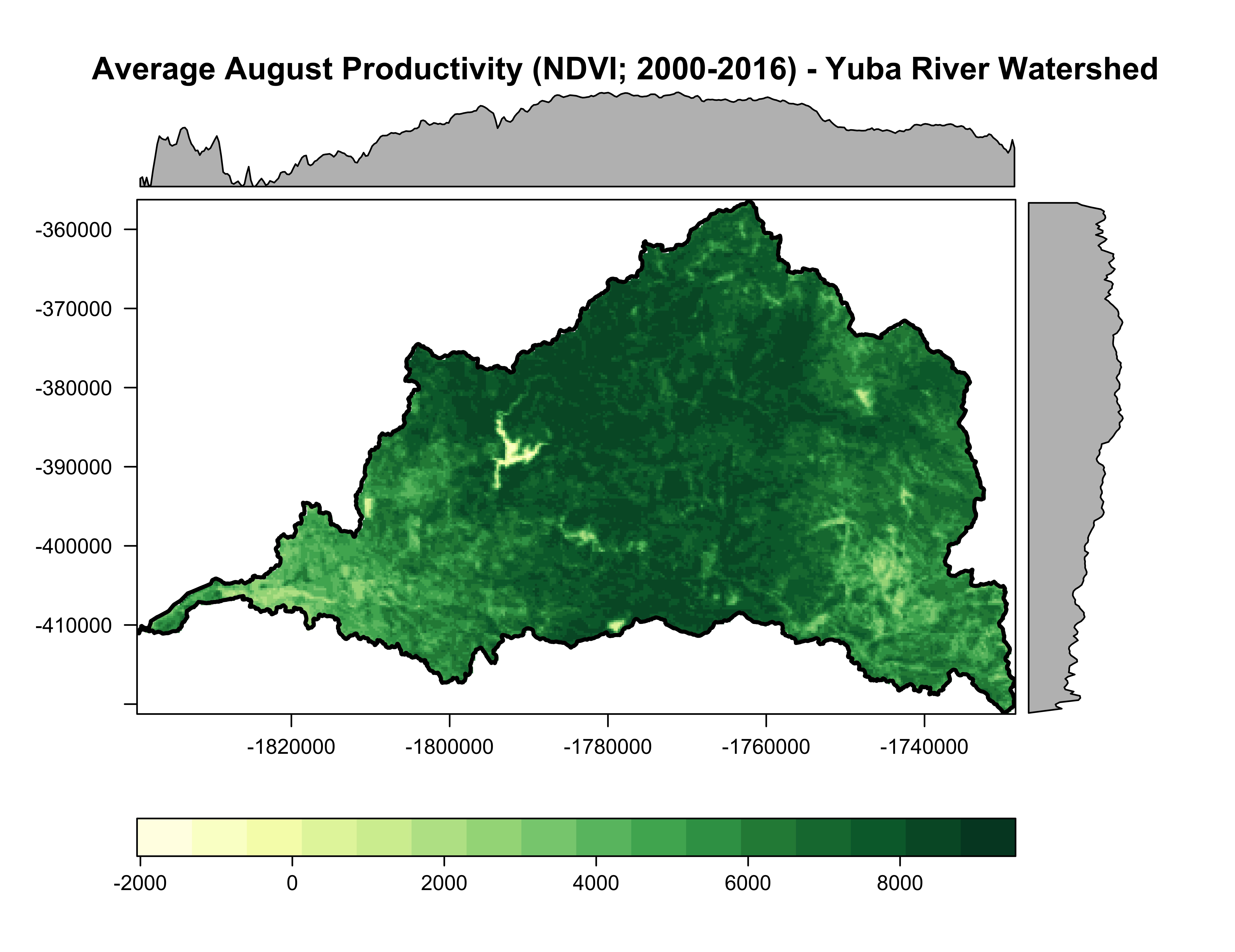
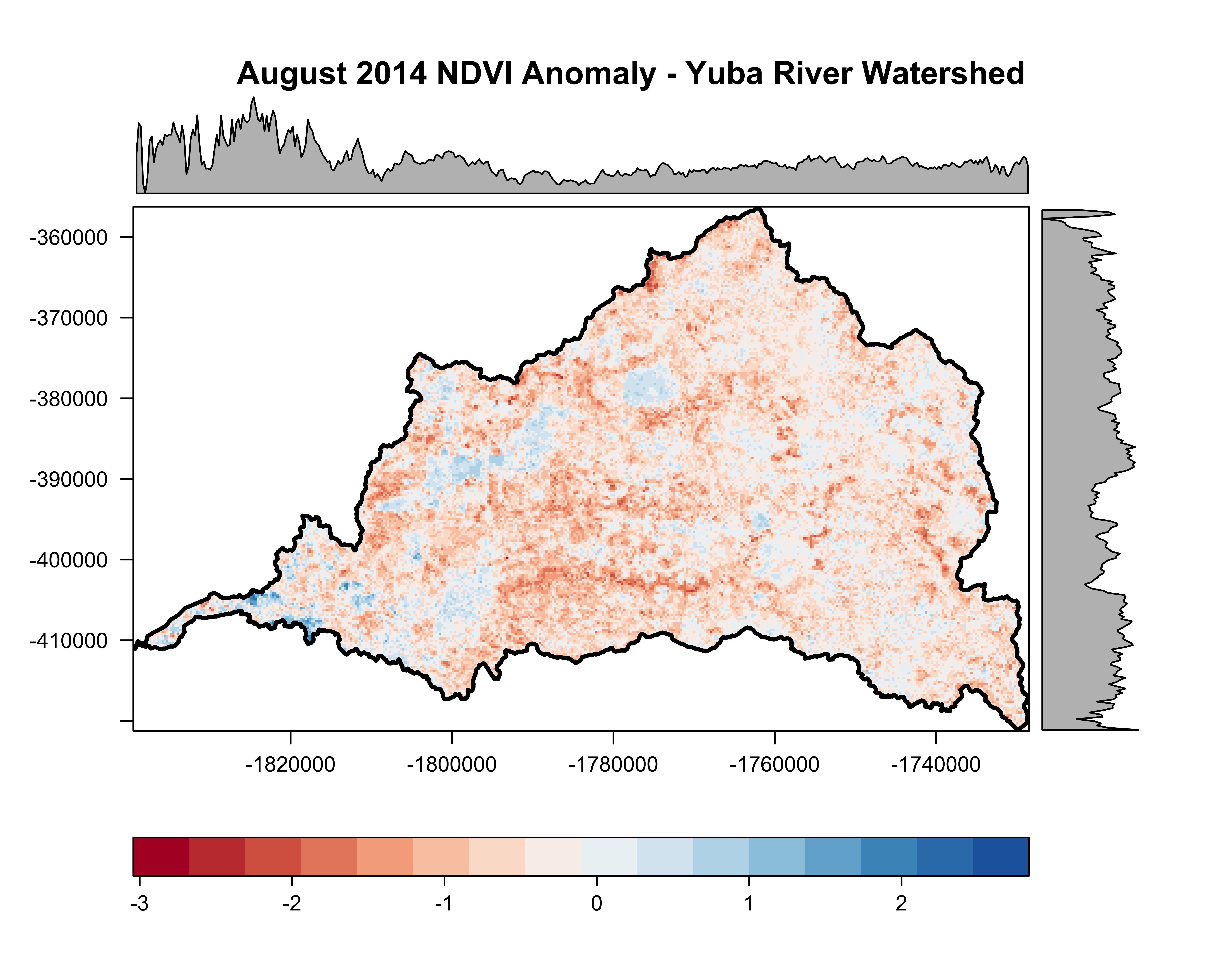
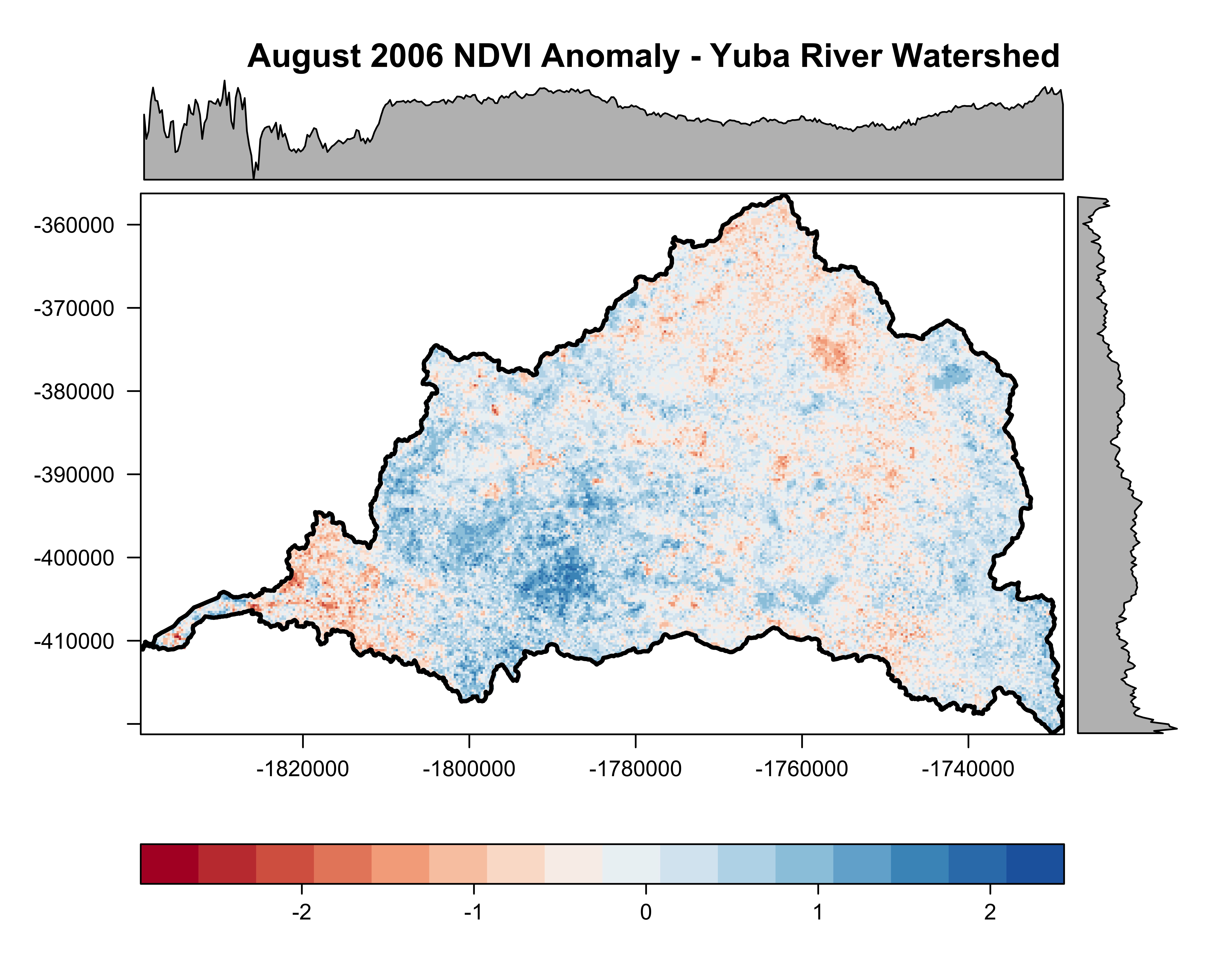
I used eMODIS (EROS Moderate Resolution Imaging Spectroradiometer) data to characterize the NDVI derived productivity of the Yuba River Basin during the month of August. eMODIS is a standardized product which uses MODIS surface reflectance from a 7-day composite period (Brown et al. 2015). I used all eMODIS images from August during the period 2000 through 2016 to calculate the 17-year August mean. I then calculated August productivity anomalies for a dry year (2014) and an average year (2006) to identify the spatial and temporal variability in productivity within the watershed (based on regional data; Malone et al. 2016).
To execute the example below, please download the data here. I have not included the base data or code to calculate the global mean and annual anomalies.
Load the required packages in R (note: the Rcolorbrewer package is loaded with the rasterVis package).
library(rgdal)   #Geospatial Data Abstraction Library
library(raster)  #Geographic data analysis & modeling Lib
library(rasterVis) #Raster Visualization library

#Load the required data: .shp (proj is the same as the raster data)
huc.shp <- readOGR(".", "yuba_watershed_HUC08_LEA")

#load raster data
Global.mean.August<-raster("august_yuba_mean_2000_2016.tif")
August.2006.Z<-raster("August_2006_Z.tif")
August.2014.Z<-raster("August_2014_Z.tif")

#Plot the mean productivity for August (2000-2016)
# set a color ramp of yellow to green
cols <- colorRampPalette(brewer.pal(9,"YlGn"))

# create a level plot - for Mean August NDVI
p<-levelplot(Global.mean.August,main="Average August Productivity (NDVI; 2000-2016) - Yuba River Watershed",
             col.regions=cols)

# overlay the spatialpolygonsdataframe
map.overlay<-p+layer(sp.lines(huc.shp, lwd=2.5, col='black'))

#plot the data
plot(map.overlay)

#export graphic
jpeg("Global_mean_August.jpg",width=8,height=8,units="in",res=1200)
plot(map.overlay)
dev.off() # turn off png device

Plot the 2014 and 2006 August productivity anomalies:#plot Aug 2014 anomaly (dry year)
# set a color ramp of red to blue
cols <- colorRampPalette(brewer.pal(9,"RdBu"))
p<-levelplot(August.2014.Z,main="August 2014 NDVI Anomaly - Yuba River Watershed",
             col.regions=cols)
map.overlay<-p+layer(sp.lines(huc.shp, lwd=2.5, col='black'))

#plot Aug 2006 anomaly (average year)
cols <- colorRampPalette(brewer.pal(9,"RdBu"))
p<-levelplot(August.2006.Z,main="August 2006 NDVI Anomaly - Yuba River Watershed",
             col.regions=cols)
map.overlay<-p+layer(sp.lines(huc.shp, lwd=2.5, col='black'))


Literature Cited
Brown, J. F., D. Howard, B. Wylie, A. Frieze, L. Ji, and C. Gacke. 2015. Application-ready expedited MODIS data for operational land surface monitoring of vegetation condition. Remote Sensing 7:16226–16240.
Malone, S. L., M. G. Tulbure, A. J. Pérez-luque, T. J. Assal, L. L. Bremer, D. P. Drucker, V. Hillis, S. Varela, and M. L. Goulden. 2016. Drought resistance across California ecosystems: evaluating changes in carbon dynamics using satellite imagery. Ecosphere 7:1–19.
