KSU GIS Day Demo: Make a map in R
In celebration of the Kent State University Department of Geography’s GIS Day, I’ve created a hands-on demo of how to make a map in R using ggplot2 and posted it here for those who couldn’t make the demo.
This is a very basic example and does not go into great detail of R or spatial data in R (we don’t have that kind of time!). But if you already know a little something about R and spatial data, this exercise will get you up and running and hopefully serve as a template for your future work.
**Prior to this exercise, create a new RStudio Project in a new working
directory, name of your choice. Then in Finder or WindowsExplorer,
create two sub directories: “SourceData” and “Figures”. Place all data
into the “SourceData” directory.
**
The data can be accessed on github. Special thanks to MapIt! and Jessica Reese for KSU campus data.
You will need the following packages for this demo: raster, ggplot2,
sf, gridExtra
If they are not installed on your machine, do so now:
install.packages(c("raster", "ggplot2", "sf", "gridExtra"))

Once installed, they will need to be loaded:

library(raster)
library(ggplot2)
library(sf)
library(gridExtra)
Map 1 – KSU Campus Buildings
First we will load the required shapefiles:
KSU_Campus <- st_read("SourceData/KSU_Boundary.shp")
KSU_Buildings <- st_read("SourceData/KSU_Buildings.shp")
Note: we will not go into details of projections here, but spatial objects used in the same plot must have the same projection. This set of files have the same projection.
Next we will make the map using ggplot:
Map1<-ggplot() +
  #load campus boundary first
  geom_sf(data = KSU_Campus, size = 0.25, color = "black", fill = "gray80") +
  #load buildings second - ggplot adds each layer in order, so we want buildings on top
  geom_sf(data = KSU_Buildings, size = 0.5, color = "darkblue", fill = "yellow") +
  coord_sf()+
  #add labels
  labs(title = "Kent State University Campus",
       subtitle = "Building Footprints - 2019",
       caption = "Data Sources: KSU Data (Map It!); OH Data (Ohio DOT)")+
  theme_linedraw() #this will remove the default gray background from the map
Map1 #plot map
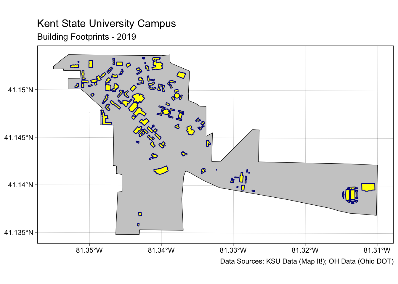
We can save it to the Figures directory using ggsave():
ggsave("Figures/KSU_Map.jpg", Map1, width=8, height=4, dpi=300) #save map
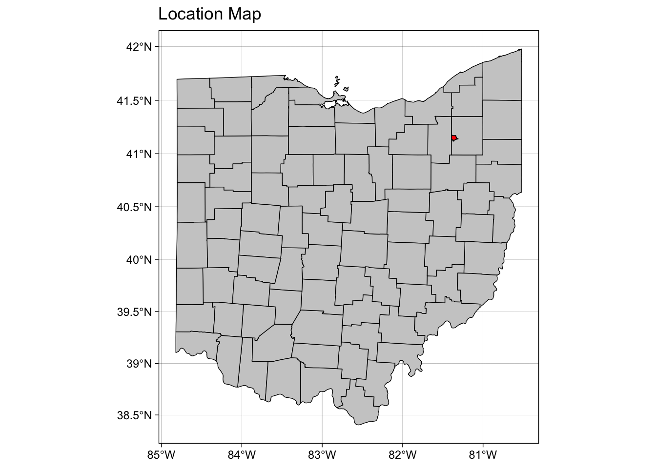
Map 2 – Kent Vicinity Map
Let’s create a second map so we know where in Ohio Kent is located.
First we’ll load some additional shapefiles, then create the map:
OH_County <- st_read("SourceData/OH_Counties.shp")
OH_Kent <- st_read("SourceData/Kent_OH_Boundary.shp")

#Next we will make the map using ggplot:

Map2<-ggplot() +
  #load county boundaries first
  geom_sf(data = OH_County, size = 0.25, color = "black", fill = "gray80") +
  #load Kent boundary second - ggplot adds each layer in order
  geom_sf(data = OH_Kent, size = 0.25, color = "black", fill = "red") +
  #here is a different way to add a title
  ggtitle("Location Map") +
  #let's hide the axis ticks and labels since we aren't worried about those details at this scale
  theme(axis.ticks = element_blank(), axis.text.x = element_blank(), axis.text.y=element_blank())+
  theme_linedraw() #this will remove the default gray background from the map
Map2
Not bad, but if we show the town of Kent as a polygon it probably won’t scale well. Let’s convert the Kent polygon to a centroid, then we’ll show it on the map as a point.
OH_Kent_Centroid <- st_geometry(st_centroid(OH_Kent))
Now we’re ready to make another map using the new centroid:
inset.map<-ggplot() +
  #load county boundaries first
  geom_sf(data = OH_County, size = 0.25, color = "black", fill = "gray80") +
  #load Kent centroid; we'll display as a square (shape = 15)
  geom_sf(data = OH_Kent_Centroid, size = 1, color = "red", shape= 15) +
  ggtitle("Kent Location Map") +
  theme(axis.ticks = element_blank(), axis.text.x = element_blank(),
        axis.text.y=element_blank(),
        panel.border = element_rect(colour = "black", fill=NA, size=1))+
  theme_linedraw() #this will remove the default gray background from the map
inset.map
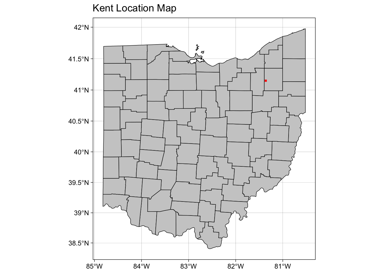
This should be much better for scaling the map in the next step.
Map 3 – Composite Map
Now let’s put the two maps together into a composite map. Since we
already wrote the two maps to objects, we can simply call them here and
arrange using the gridExtra package.
# We'll have two columns, specify the order and the width of each map
composite_map<-grid.arrange(Map1, inset.map, ncol=2, widths=c(7,3))
composite_map
#save the map
ggsave("Figures/Composite_map.jpg", composite_map, width=8, dpi=300)
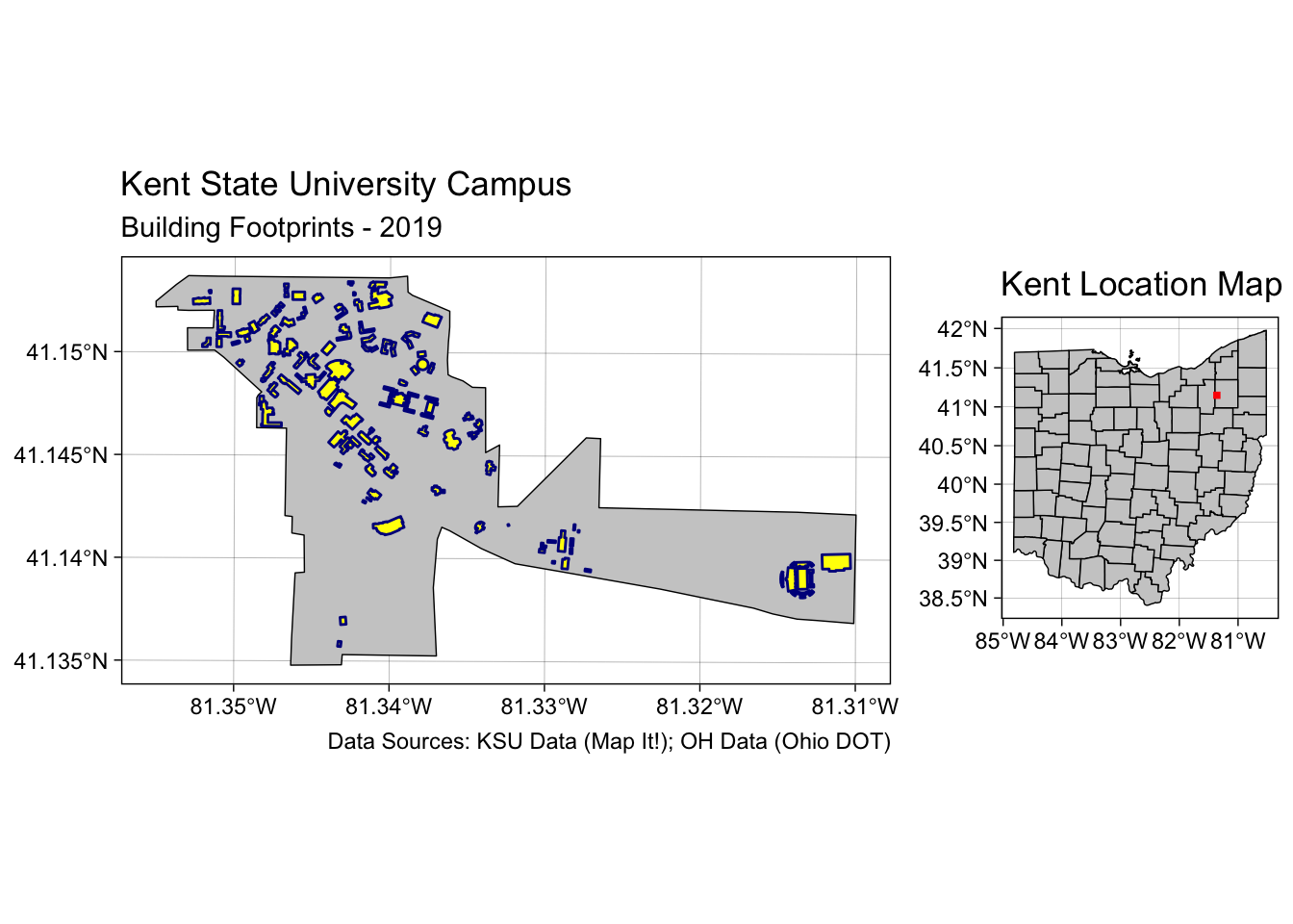
Now that’s a publication quality map that didn’t take all that much code to create. Hopefully you can use this template to create future maps. Go forth and be spatial!